
The research team collaborated with a Steering Committee, and d/Deaf, Disabled, and Neurodivergent artists who took part in workshops to plan how to present the information on this website.
This page discusses the Accessibility of the website.
You can read a Plain English version of this Access webpage here.
The features important in accessing web content discussed in the workshops included -
Structure
- Uses clear headings and navigation
- Includes meaningfully structured HTML tags such as <header>, <nav>, <main>, <footer> to explain the order in which to read the text in the default Omeka S layout theme
Style
- Shorter sections of text
- Pictures, symbols, and other visual content to support text
- No confusing, overwhelming, or difficult to access pop ups or videos playing as soon as the website opens
Colour, font, and layout
- Dark colour on light but not bright white background, single colours, single columns - with some differences in preference for light mode and dark mode reading
- Avoids use of red and green which can be difficult for users with colour reading differences
- Larger, less crowded, sans serif font settings, and option to increase font to larger size
- Use of bold, underline, italics or other markers to help follow the flow where there is a long section of text, or there is a hyperlink to another section of text, page, or resource
Accessibility features
- Use of plain English writing - rather than academic English writing - wherever possible throughout the website
- ALT Text / Image description for pictures, symbols, and other visual content in the website
- Transcripts, captions, and wherever possible Auslan interpretation for video content created for the website
We have used Omeka software to build this website. This software was recommended to us for its capacity to display digital collections. The Omeka website provides information about their commitment to making Omeka S an accessible option for building collections and exhibits online. The site is hosted via the Australian Research Data Commons (ARDC) Nectar research cloud.
This has allowed us to create a searchable repository which references over 10,000 persons, organisations, works, places, and events - and do so on a fixed budget.
Accessibility limitations
The disabled artists who have built the site, and tested the features - for example, screen reading - estimate the site is around 70% accessible.
The main access problems are:
1. We have retained the language in use at the time, which will not necessarily align with how we describe and define Disability and Disability Arts today. To address this, we have created a page on Upsetting Content, providing a warning for users and explaining our reasoning for including these documents in the archive.
2. The use of open source software has impacted the accessibility of the site:
- The webpages do use shorter sections of text and images, with links to Plain English versions, and ALT text for the images
- The webpages do, upon testing, work with Screen Readers
- If users are using the Link List feature in their Screen Reader to read by tabbing through hyperlinks
- The main pages - Home, About This Website, About This Project, etc. - have descriptive hyperlinks
- The pages for each record uploaded into the database in the website follow the same structure for each Item
- This structure is based on the Schema.org vocabulary we used to categorise the records into spreadsheet, then to upload the records into the website, and on the Omeka software we used to create a searchable database
- Identifier
- Title
- Publisher
- Date
- Relations (to Places, Persons, Organizations, or Works)
- Gender (Male, Female, Other)
- Category (Person,, Organization, Creative Work, Book, Action)
- Type (for example, Article<Report)
- Format (for example, DigitalDocumentText, Image)
- Language (for example, English, Auslan)
- Keyword (for example (Multi Arts, Advocacy and awareness raising)
- Copyright
- Item set (for example Person, Organization, Creative Work)
- Media (available as URLs or PDFs)
- Linked resources (cross-linked to the Item)
- Not all Item pages in Omeka have all of these - for example, Organizations and Creative Works will not have a Gender
- Not all Item's will have the same number of related Persons, Organizations, and Creative Works - the list can be short, or it can be very long, with a lot of related Items to click through to, and learn more about
- If users are using the Link List feature in their Screen Reader to read by tabbing through hyperlinks
- The Omeka S platform does not have a feature to flip between different fonts, or between dark and light mode
3. The inclusion of archival PDFs has also impacted the site's accessibility. Many of the PDF documents include photocopies or scans of print materials from the 1970s, 1980s, and 1990s, which screen readers cannot access. We have sought to address this in the following ways:
- On testing, we have found that the Read Aloud function in Adobe Acrobat works to read a number of the PDFs after we have used extract text while uploading the archival PDF, but not all of them. For example, the Read Aloud:
- will read the text in "High Beam Festival 1998 Flyer" well, though it will not for example say the decorative frames for text sections / columns are in the colour yellow
- will read the text in "Arts Access Victoria - Arts Access Society Inc. - Access Newsletter Vol.1 August 1985" with some mistakes, due to flattened images and use of columns in the original photocopied / printed document
- will not read the text from "Arts Project Australia - Works From The 1985 Program For Moderately To Severely Intellectually Disabled Artists 1986 - Promotional Flyer" due to flattened images in the original photocopied / printed document
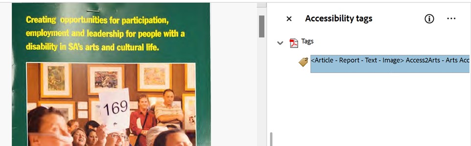
- Where extracting text for this Read Aloud function in Adobe has not worked, we have not had budget, time, or capacity to transcribe all the text and list all the images in more than 1,000 documents, with tens of thousands of images, to create new screen readable versions. Instead, we have included a description summarising the content of every PDF document, and we have - as demonstrated in the above image - put this description in the ALT text in the Accessibility Tags of each of the documents.
- With improvements in AI in the past year, we have found that where the Read Aloud function in Adobe has not worked, putting the PDF into Microsoft CoPilot with an "Extract text from this page. Include title, metadata, and image descriptions as relevant" has begun to work fairly well, though not with 100% accuracy of a human transcription/description of images.
We have also provided a lot of detail in this Access page, the Terminology, Scope, and Future Development page, and the Credits and Acknowledgments. We have provided Plain English summaries for each of these pages as well.
Web Content Accessibility Guidelines (WCAG) Conformance Statement
This website has been designed with reference to Web Content Accessibility Guidelines (WCAG) 2.1 Level AA accessibility standards, informed by consultation with d/Deaf, Disabled, and/or Neurodivergent artists.
The WGAC 2.1 Guidelines add to the 2.0 Guidelines with 17 new criteria, to address access for people using Mobile devices, people with Low Vision, and people with Cognitive and Learning Disabilities.
It incorporates semantic structure, screen reader compatibility, and inclusive design features identified as important by contributors.
While the platform supports key accessibility functions, some features only partially meet WCAG 2.1 Level AA criteria due to platform limitations, budget constraints, and the archival nature of over 1,000 scanned documents.
The following breakdown outlines features that support WCAG 2.1 Level AA compliance, and those that are partial or non-compliant.
Features Supporting WCAG 2.1 Level AA Compliance:
- Semantic HTML structure using <header>, <nav>, <main>, and <footer> meets WCAG 2.1 Level AA – 1.3.1 (Info and Relationships)
- Screen reader compatibility meets WCAG 2.1 Level AA – 1.1.1 (Non-text Content), 2.4.1 (Bypass Blocks), and 4.1.2 (Name, Role, Value)
- ALT text for images and visual content meets WCAG 2.1 Level AA – 1.1.1 (Non-text Content)
- Hyperlinks on the main navigation pages on the website have a clear title, and an advisory title that clearly describes the purpose or destination of the link. The hyperlinks on the records pages use the literal title of the Publisher, Place, Organisation, Creative Work, Person, or other Category they refer to, as relevant. This meets WCAG 2.1 AA (Link Purpose - In Context) because it allows users - including Screen Reader users - to understand the purpose and destination of links by reading the link in isolation, without reading the text around it for further context.
- Use of plain English writing supports WCAG 2.1 Level AA – 3.1.5 (Reading Level)
- Font size, contrast, and layout choices meet WCAG 2.1 Level AA – 1.4.3 (Contrast - Minimum), 1.4.4 (Resize Text), and partially meet 1.4.8 (Visual Presentation – AAA)
- Absence of autoplay or disruptive popups satisfies WCAG 2.1 Level AA – 2.2.2 (Pause, Stop, Hide)
- Transcripts and captions for video content meet WCAG 2.1 Level AA – 1.2.2 (Captions) and 1.2.3 (Audio Description or Media Alternative)
- Consistent navigation and structure support WCAG 2.1 Level AA – 3.2.3 (Consistent Navigation) and 3.2.4 (Consistent Identification)
Partial and Non-Compliance with WCAG 2.1 Level AA:
- Omeka S does not provide a module or widget to toggle between light/dark mode, large/small font, or other customisation options. This is WCAG 2.1 Level AA compliant. It is not fully WCAG 2.1 Level AAA compliant – 1.4.8 (Visual Presentation)
- Omeka S provides semantic HTML navigation (<header>, <nav>, <main>, and <footer>), but it does not explicitly provide ARIA landmarks and role attributions (<header role="banner">, <nav role="navigation">, <main role="main">, <footer role="contentinfo">). It does not provide skip navigation/skip to content links. This partially meets WCAG 2.1 Level AA – 2.4.1 (Bypass Blocks) and 4.1.2 (Name, Role, Value)
- Scanned and photocopied archival PDFs have descriptions, including Accessibility Tags in each PDF, but do not include full text transcription or a full list of images and ALT text for over 1,000 documents. This means these PDFs do not meet WCAG 2.1 Level AA – 1.1.1 (Non-text Content), due to time, budget, and technology constraints